Health care costs: What’s the real story?
Health care costs: What’s the real story?
As I travel around the country talking to state legislators and health care leaders, questions about health care costs are usually at the top of their lists. The first request they make is for credible, public sources of information they can use to help inform their policy decision making.
Two slides I frequently use in presentations receive the highest engagement. My informal measurements of engagement are people in the audience taking pictures of the screen when the slide appears, and comments such as, “This is incredibly helpful” or “I haven’t seen it presented like this before.”
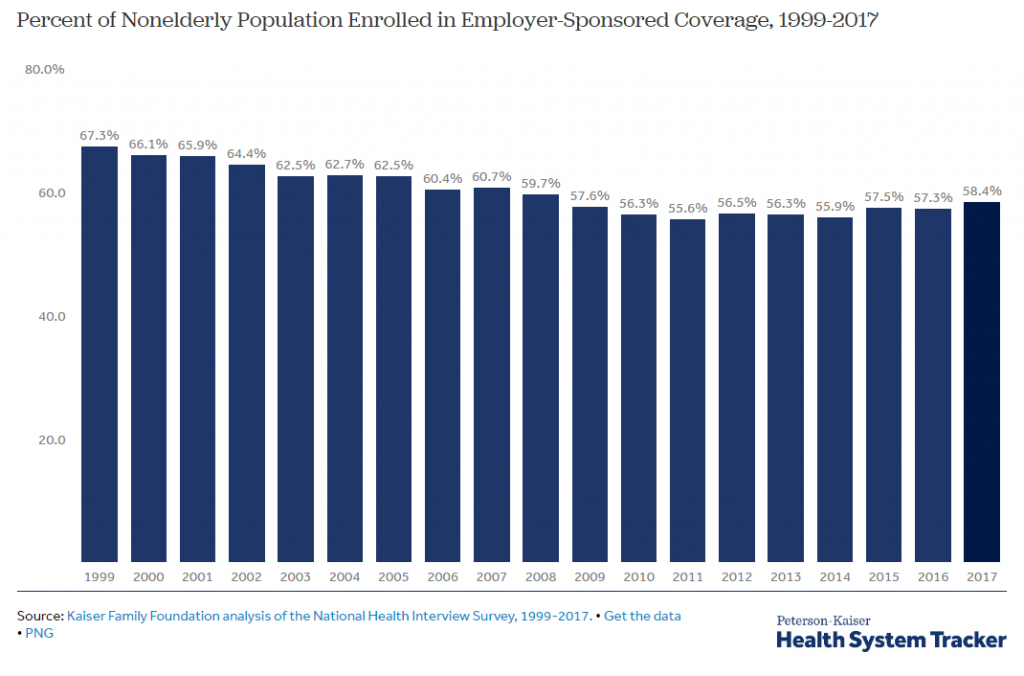
The first slide is a graphic (see below) from the Peterson-Kaiser Health System Tracker and shows how cost-sharing requirements, especially in the form of deductibles, have outpaced wage growth.
The second slide I created because the information is harder to find than you’d expect. Notably, the information is out there, but it is buried in data sets, not in a visual that can be quickly understood and easily shared.
Combining information on health expenditure data and historical inflation information the graphic (see below) shows the annual change in spending for the three most talked about categories of health care, hospitals, physician services, and prescription drugs, as well as general inflation for the last 10 years.
If you live and breathe health policy, these visuals may be no surprise to you. State legislators, on the other hand, are asked to be experts in a mindboggling array of issues. They rely on their staff and the internet to understand these issues, but what if the internet doesn’t serve up the info they need?
M2 aims to be a reliable source of information on all things health policy, and we strive to make complicated information from a multitude of sources more concise and comprehensible. Hopefully, the slides we share prove useful to you. Let us know what you think!


